











I'm Waël BouabdaWaëlI shape products, design brands, build interfaces

Distinctive identities, with real care for how things look. Complicated products, made simple to move through. The interface carried a long way into the build, hands in the code, from a blankcanvas or your repo.

Over ten years in design, the last two and a half on my own.
Design ownership, end to end. Freelance, Paris or remote.

Selected work

Also designed for

Services

Brand identity

Identities that stay recognisable everywhere they land, built as a system, not a logo in isolation.

Start one. Naming, logo, lettering and the full system, from first sketch to guidelines.

Sharpen one. Take a brand that drifted and pull it back into one consistent voice.

Affinity Adobe CC Midjourney Krea ComfyUI

Product design

Dense products made legible. I solve the hard screens, structure the information, and keep the whole experience coherent.

Zero to one. Shape a product from the first flows and screens, with a component library underneath.

Untangle. Step into a product that grew complex and make it readable again.

Figma Paper Claude Anytype Hermes

Design engineering

I meet your project where it is and work in both directions, so nothing drifts between the design and the product.

Design → code. Design it, then build the front-end in the repo next to your engineers.

Code → design. Come in from an existing repo or a fast prototype, give direction or fix it hands-on.

Next.js Tailwind shadcn/ui Cursor Claude Code

Ways to work together

Diagnostic

€1,500delivered in 3 days

Available now

  • A full read of your product and brand
  • Every problem found, ranked by cost
  • An annotated file and a walkthrough
  • An action list, formatted for your agents

Everything included
Credited in full toward the Foundation

Foundation

from €8,0003+ weeks

Available from 24 August

Every Foundation starts with the brand layer

  • Your identity, created or systematised if you already have one, delivered as code in your repo

Added to scope where the product needs it

  • Your core flows, designed and shipped
  • A design system, documented and versioned
  • Marketing site, built in Next and Tailwind

Scope and fixed price set after the Diagnostic
One project at a time

Labs

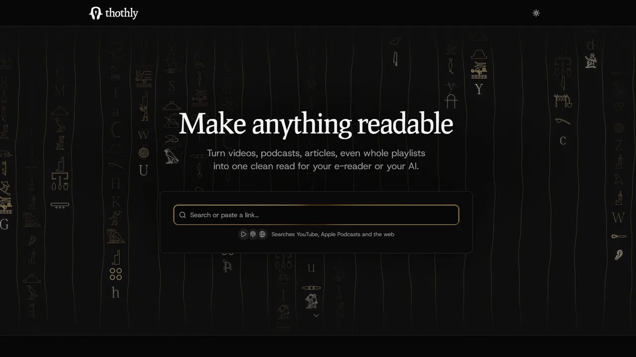
Thothly landing page: a dark hero reading “Make anything readable” over a field of faint hieroglyphs, with a box to search or paste a link and a note that it searches YouTube, Apple Podcasts and the web

Thothly

Compiles any media into readable text. View demo (opens in a new tab)
Burin in action: a photo on the left and the same image rendered as a line engraving on the right, split by a slider

Burin

Turns images into editable vector hatching. Coming soon

Writing

A modular AI stack for people who care about design

(opens in a new tab)
Waël Bouabda

Working on
something?

Based in Paris, happy to work on-site.
Call, message, whichever's easier.

Book a call (opens in a new tab)

Lagoon

6 min read

Lagoon is on-chain vault infrastructure: asset managers build and run curated strategies, depositors put money in to earn. Everything underneath is public and verifiable, but most apps hide it behind a clean screen and a confirm button. You deposit and you're left guessing where your money actually is. I designed the app to do the opposite: show what's really happening at each step.

RoleFounding designer
ScopeBrandProduct
Scale$300M+ deposits at peak

The problem

Every number on screen is a reason to deposit or to leave: APR, composition, NAV, fees. If any of them is vague, someone pulls their money. Three things were hard to show.

Money moves on a delay. A deposit doesn't become a position when you click confirm. It settles at the next valuation, once the curator approves. Most apps paper over that wait with a fake success screen. I had to show the wait honestly instead.

Yield is not one number. What you earn is a base return plus separate reward streams from the protocols the vault touches. Folding all of it into a single APR hides where the money comes from.

A vault is a set of addresses. Who can value it, who can upgrade it, where fees go, what is locked: all of it is on-chain, and most apps never surface it.

Role & scope

Founding designer. I owned the product design end to end: the UX/UI, the flows, and the components, from the first screens to a shipped library. That ran across both sides of the app. The curator side, where vaults are deployed, configured and operated, is a denser and more complex workflow than the depositor side, and I designed all of it; this case stays on the depositor experience and only samples the curator tooling. The specs came from the CTO, one of the cofounders, and my job was turning them into the actual interface. Outside the product itself, the brand identity and the marketing assets (landing page included) were mine too. The app's front-end was built by the engineers.

Two users, one surface

Two groups use the same app for opposite reasons. A depositor wants to know what they get and what they risk before moving money. A curator wants fine-grained control over how a vault is built and run. I kept the journeys structurally apart: a depositor goes Earn, then Vault detail, then Portfolio; a curator goes Create, then Configure, then Operate.
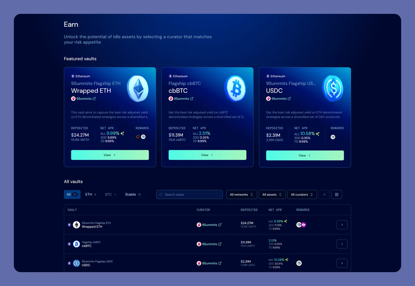
The Earn page: three featured vault cards with APR and TVL, above a full vault table with asset tabs and filters by network, asset and curator
Earn, the depositor's front door. Featured vaults first, then the full list, filterable by network, asset and curator. The navbar carries the protocol's live TVL.

Show where your money is

Because deposits and redemptions settle on a delay, one confirm button wasn't enough. I treated money movement as four explicit flows (Deposit, Redeem, Claim, Withdraw), each one running confirm, processing, then done, with the delay spelled out at every step. Here is the deposit one.

Say what's happening with timing. The confirmation reads, word for word: "The position will be activated upon curator approval at which point your vault shares become available." That sentence holds through loading and completion; nothing flips to done until the chain says so.
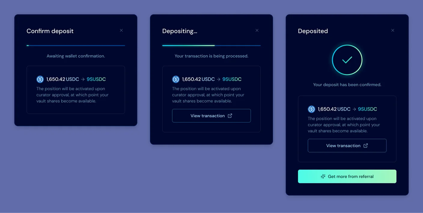
The deposit flow in three modal states side by side: Confirm deposit (awaiting wallet confirmation, 1,650.42 USDC to 9SUSDC), Depositing (transaction processing), and Deposited (confirmed), each repeating the notice that the position activates upon curator approval
The deposit, stated the same way at every step: Confirm, processing, done, with the curator-approval condition repeated through all three. No fake success the second you click.

Never hide where a request is. Back on the vault page, the position panel tracks the full life of a position as a state machine: every step it can be in is a named state, and the panel always shows the current one.
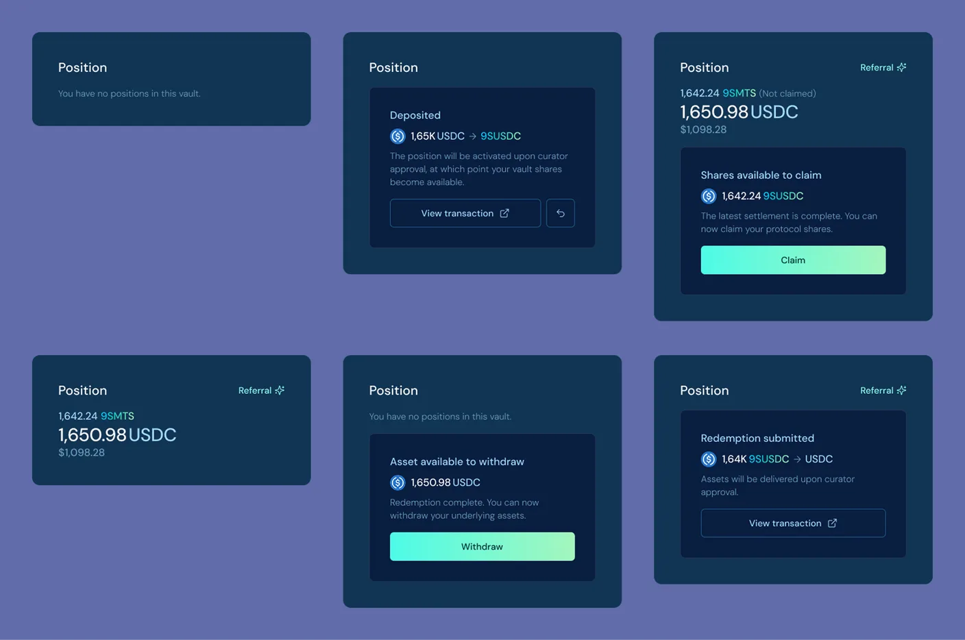
The position panel in its six states: no position, deposit pending curator approval, shares available to claim, an active position, redemption submitted, and assets available to withdraw, each labelled with its amount
Every state of a position, named: none, deposit pending approval, shares to claim, active, redemption requested, assets to withdraw.

The Portfolio page repeats the same logic at the account level: total deposited, net APR, total earned, and every position with its status, pending requests included.
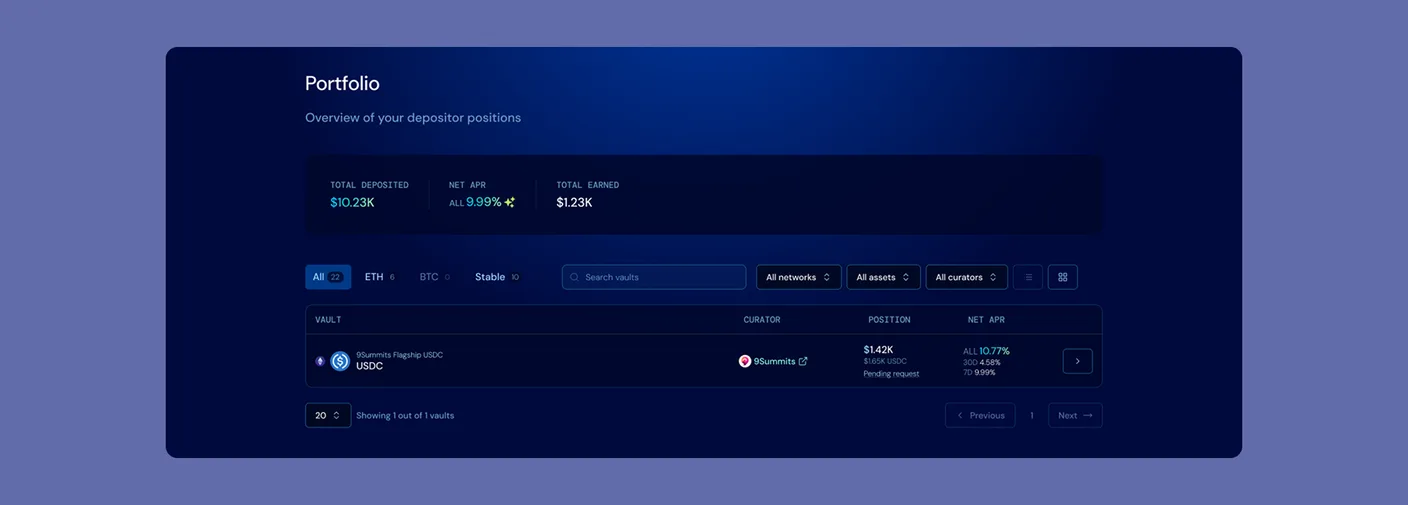
The Portfolio page: total deposited, net APR and total earned in a summary strip, then a table of positions with curator, value and a pending request status chip
Portfolio, the account-level read: three totals, then every position with its status. A pending request shows up as a state.

Show what you're actually earning

The performance chart was the hardest part to keep honest, for two reasons.

The price moves in steps, not curves. A vault's price per share only changes when the curator settles a new valuation, then holds flat until the next one. So the chart is a staircase: each tread is the stretch between two settlements, where the price is fixed and known.

Not all the return lands in the price. Vaults earn extra reward streams from the protocols they use, and those rewards belong to the vault and its depositors, but they don't show up in the price per share. A chart that plotted only the share price would understate what the vault actually returned.

So I kept the price-per-share line stepped as it is, and overlaid each reward stream as its own band on top, with a reward-adjusted total. On hover, a single day is itemised: price per share, each reward source by name, and the adjusted figure. In the example, 1.09 USDC of price per share plus 0.15 from Resolv and 0.05 from TAC gives 1.29 reward-adjusted.
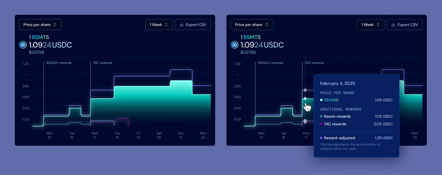
The performance chart in two views side by side: the stepped price-per-share line with RESOLV and TAC reward streams overlaid as bands, and the same chart on hover with a tooltip itemising price per share 1.09 USDC, Resolv 0.15, TAC 0.05, and reward-adjusted 1.29 USDC
The price-per-share line steps at each settlement, with the reward streams as their own bands above it. On hover, the day breaks out: base price, each reward by name, reward-adjusted total.

The same applies to the APR. Rather than one headline percentage, it unfolds into its sources, each explained inline where it appears: a base yield from the strategy, additional vault rewards (Resolv, TAC), external reward tokens, and points incentives.
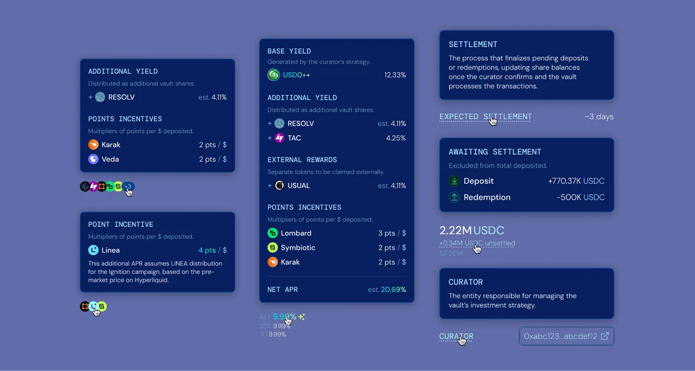
Inline explainer tooltips for the APR: base yield 12.32%, additional vault rewards from Resolv and TAC at 4.25%, external rewards such as Usual, and points incentives from Lombard, Symbiotic and Karak, adding to a net APR of about 21.69%, alongside tooltips explaining settlement, awaiting-settlement balances and the curator role
The APR opened into its sources: base yield, additional and external rewards, and points, with inline notes on settlement and roles.

Show what's under the hood

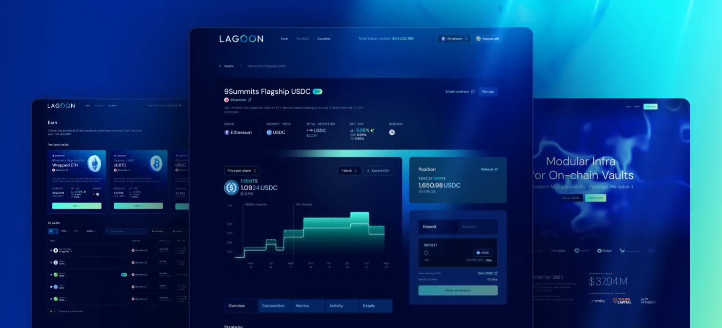
The vault page opens on a top-down read: identity and headline figures first (name, curator, network, asset, APR, TVL), then the chart, with a Position panel pinned to the right. Everything else sits in five tabs.

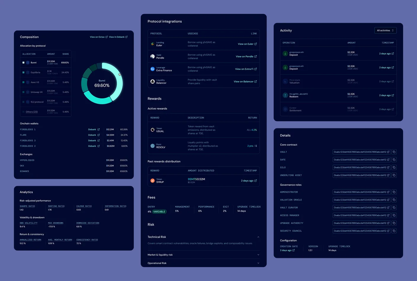
Overview lays out the strategy, the protocols the vault touches, the active and past rewards, the fees, and the risk categories. Composition shows where the capital sits, by protocol and by token, down to the on-chain wallets and exchanges that actually hold it. Metrics carries the risk-adjusted numbers: Sharpe, volatility, and the max drawdown an APR alone hides. Activity is the full log of deposits, valuations, redeems and settlements, each with an address and a timestamp. Details lists every contract and governance role with its address.
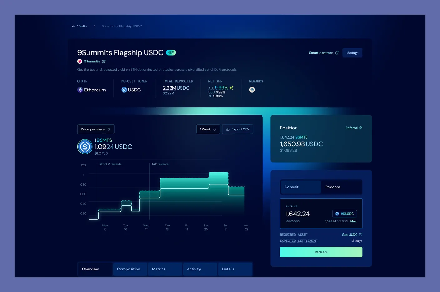
The 9Summits Flagship USDC vault page: name, curator, chain, deposit token, total deposited, net APR and rewards in the header, the stepped price-per-share chart on the left, the position panel with Deposit and Redeem on the right, and the Overview, Composition, Metrics, Activity and Details tabs below
The top of the vault page: identity and headline figures, chart and position panel side by side, then the five tabs below.
The vault tabs opened out on one board: Composition (allocation by protocol and token with a donut, down to the on-chain custody wallets and exchanges), Protocol integrations, active and past Rewards, Fees, Risk categories, the risk-adjusted Metrics (Sharpe, drawdown), the full Activity log, and the Details tab with every contract and governance role address
The five tabs, opened out: composition down to the custody wallets, the protocols, rewards, fees and risk, the risk-adjusted metrics, the full activity log, and every contract and role address.

Tell people when a vault isn't vetted

Anyone can deploy a Lagoon vault, and any vault is reachable by its URL. The vaults inside the app are a curated set the team has looked at, but a depositor can still land on an unvetted one by following a link. So I designed a warning for a vault the team hasn't verified: a banner saying it was built with Lagoon's open tools, hasn't been checked, and that you should be sure you trust the curator before depositing. The vault's own figures stay visible right under it.
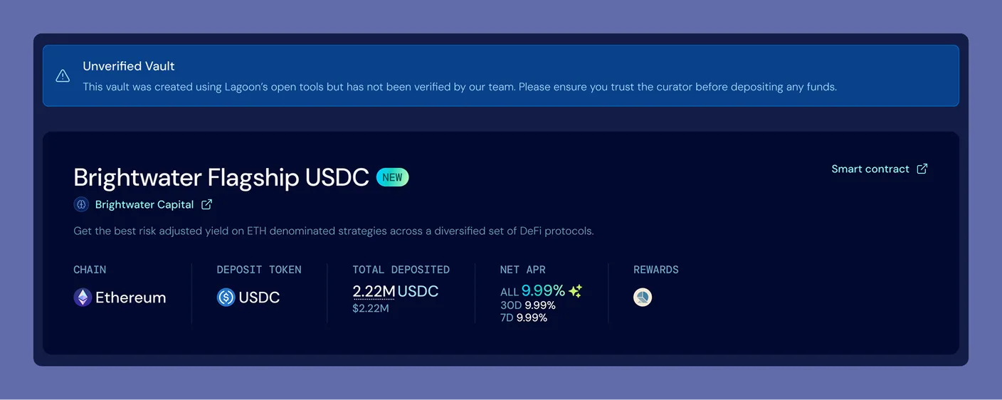
An unverified-vault banner above a vault header: the banner says the vault was created using Lagoon's open tools but has not been verified by the team and to ensure you trust the curator before depositing, shown above the Brightwater Flagship USDC header and its figures
The banner I designed for an unverified vault reached by URL. It sits right above the vault's own figures.

The same checks, for the curator

A curator's actions are high-stakes and mostly irreversible, so the tooling makes each one checkable before it goes on-chain. Vault creation ends on a review screen that puts every address and every locked parameter in one place (the roles, the fee rates, the rate-change and upgrade timelocks) before the deploy transaction. Pricing the vault works the same way: a simulated NAV the curator reads before settling it on-chain.
Vault deployment review screen: vault information, roles and fee structure recapped with their on-chain addresses, the rate-change and upgrade timelocks, and a deploy button, all on one screen before the transaction
The deployment review: every address and locked parameter on one screen before the curator signs.

The component library

Behind all of it is a component library built around the real states, not just the happy path: deposit and redeem inputs and their variants, vault tables and cards, composition and activity tables, four chart variants, position and action panels, transaction modals, six toast states, alerts, tooltips, and the curator-only pieces (whitelist, deposit limit, rewards, referral).

UGAP

2 min read

UGAP is France's central public purchasing body: suppliers win public tenders to join its catalogue, and public buyers order from it without running a procurement procedure of their own. I spent about eight years designing its e-commerce site, one of four core designers on the redesign. This is a selection of that work.

RoleDesign + RGAA front-end
TeamOne of four core designers
Duration8 years

UGAP's catalogue sits on top of an enormous, historically layered public system: dozens of incompatible business logics, public-procurement rules on every purchase, its own wall of acronyms. Most of what you buy fits a shelf. Some needs don't, and then a buyer, a supplier and UGAP have to converge on one custom quote. I designed across the site to a single design system and the RGAA accessibility standard (the French public-sector requirement). What follows is a selection.

The red UGAP logo, a rotated square wordmark, centred over a pale white 3D render of a French town square.

The bespoke flow

The default path is self-service: browse the catalogue and buy. When the catalogue can't serve the exact need, the buyer drops into an expression de besoin, a guided form that opens a custom-quote workflow the three parties share. Express the need, clarify with the supplier through messaging that lives inside the request, receive a quote, turn it into an order, track it from the account. What used to run on email, phone and spreadsheets becomes one legible journey.

The bespoke path end to end: pick the suppliers, express the need, exchange with the supplier, receive the quote, turn it into an order.

The storefront

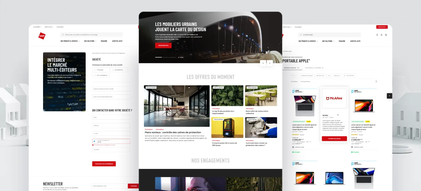
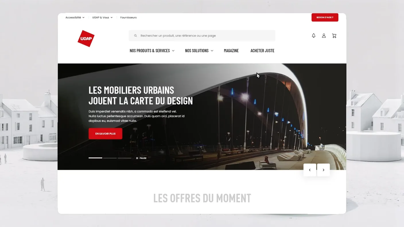
The UGAP homepage: a full-width hero about urban furniture design, a row of offer cards, an engagements band and a grid of product universes.
The homepage: offers, editorial and every product universe in one place.
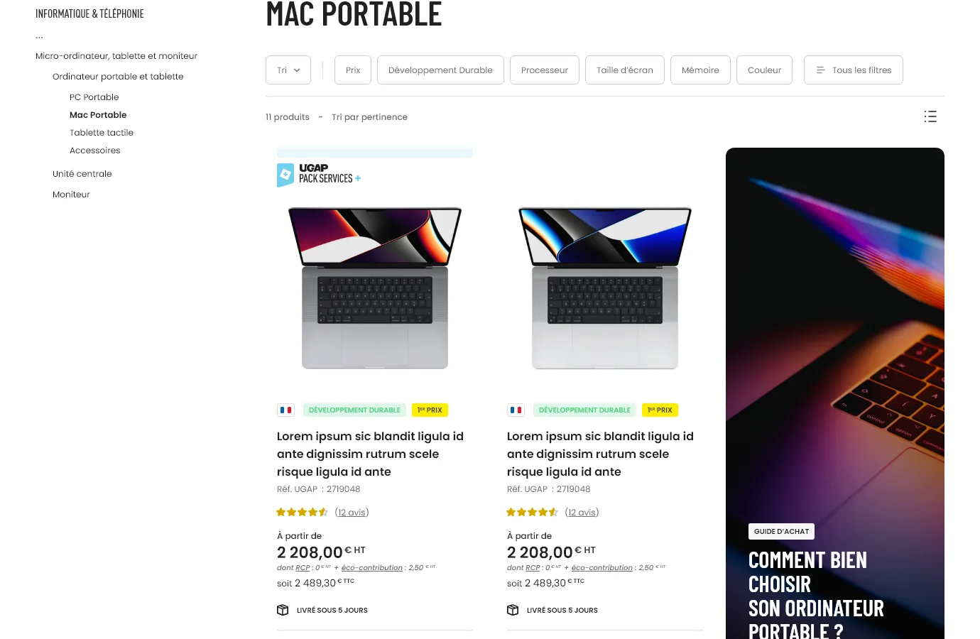
A UGAP category page for laptops: a left-hand category tree, a row of filter chips (price, sustainability, processor, screen size, memory, colour), and a grid of product cards with prices and delivery times.
Catalogue and filters
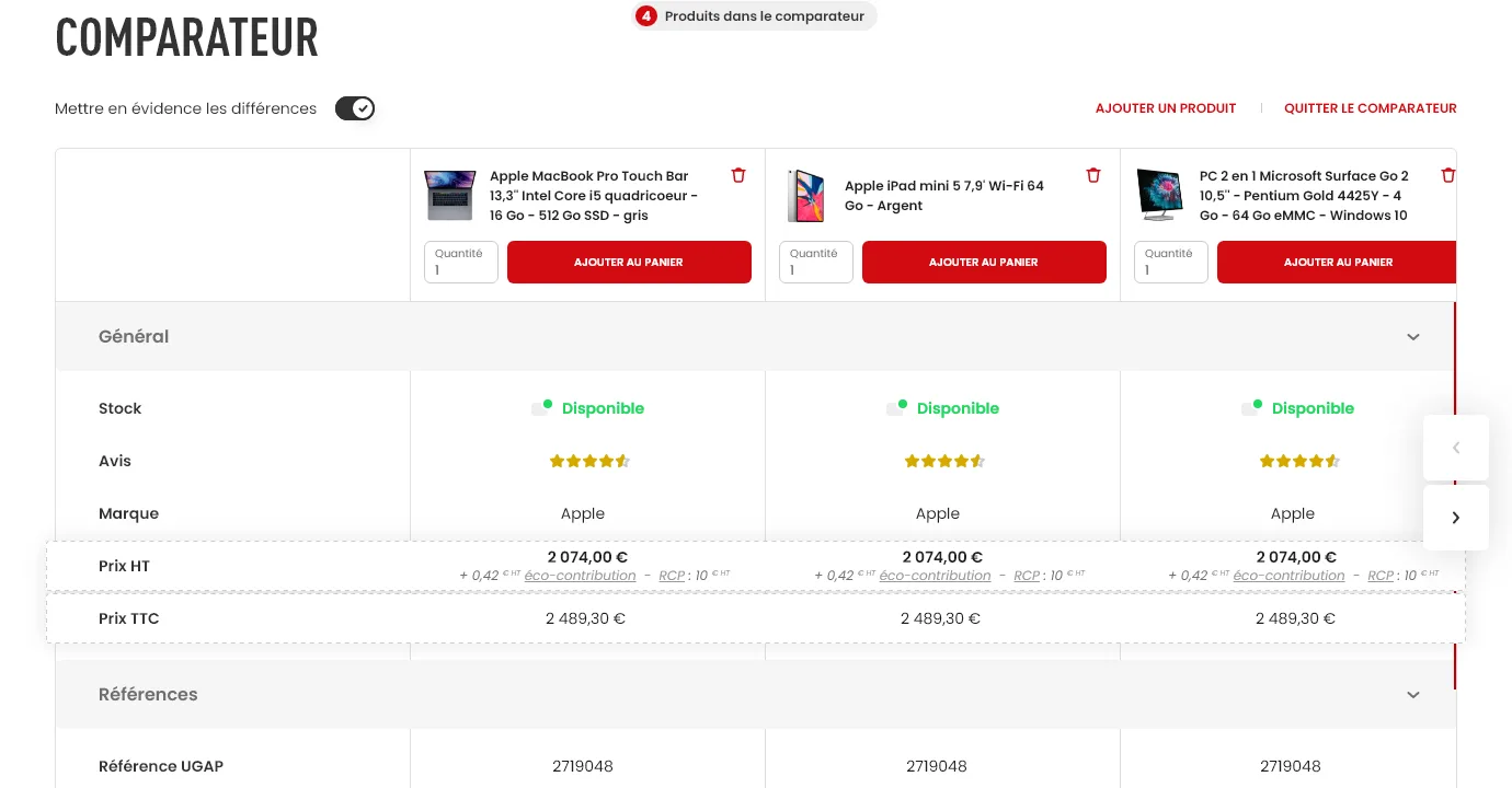
The UGAP comparison tool: three products side by side with a highlight-the-differences toggle, and a table comparing stock, ratings, brand, prices and reference numbers.
Comparison tool
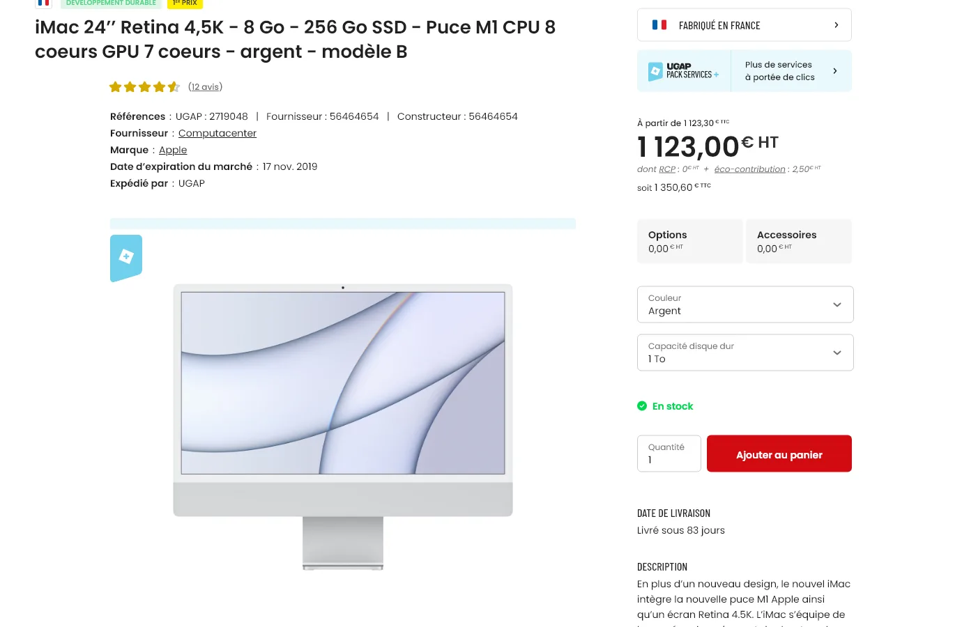
A UGAP product page for an iMac: title, ratings, supplier and reference details, a large product image, and a purchase panel with price, colour and storage selectors and an add-to-cart button.
Product page

One stateful request

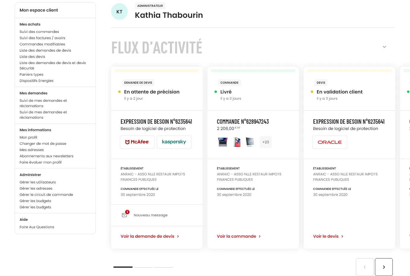
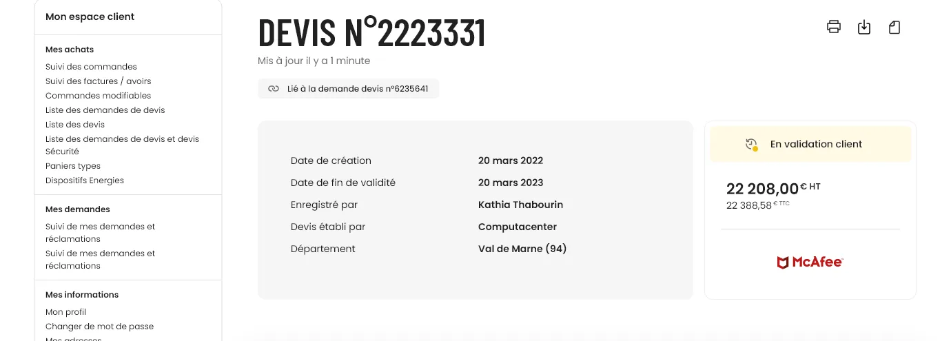
The custom quote is tripartite: buyer, supplier, and UGAP as intermediary. A single demande travels through named states, from expression of need to order delivered, surfaced in an activity-feed cockpit so a buyer always knows where each request stands. The quote header puts the two parties on one side, status and total on the other: one agreement, not three separate threads.

The UGAP client account home: a user header, then an activity feed of request cards, each with a status chip (awaiting details, delivered, client validation), the suppliers involved (McAfee, Kaspersky, Oracle), the ordering establishment and dates, and one card flagging a new message.
The account home as a cockpit: every request as a card with its current state.
A UGAP quote detail header: the quote number and a link back to its request, a card listing creation and validity dates, the UGAP contact who registered it and the supplier who drew it up, and a card showing a client-validation status, the total (22,208 euros before tax, 22,388.58 including tax) and the McAfee mark.
The quote header: the two parties on the left, status and total on the right.

Mobile

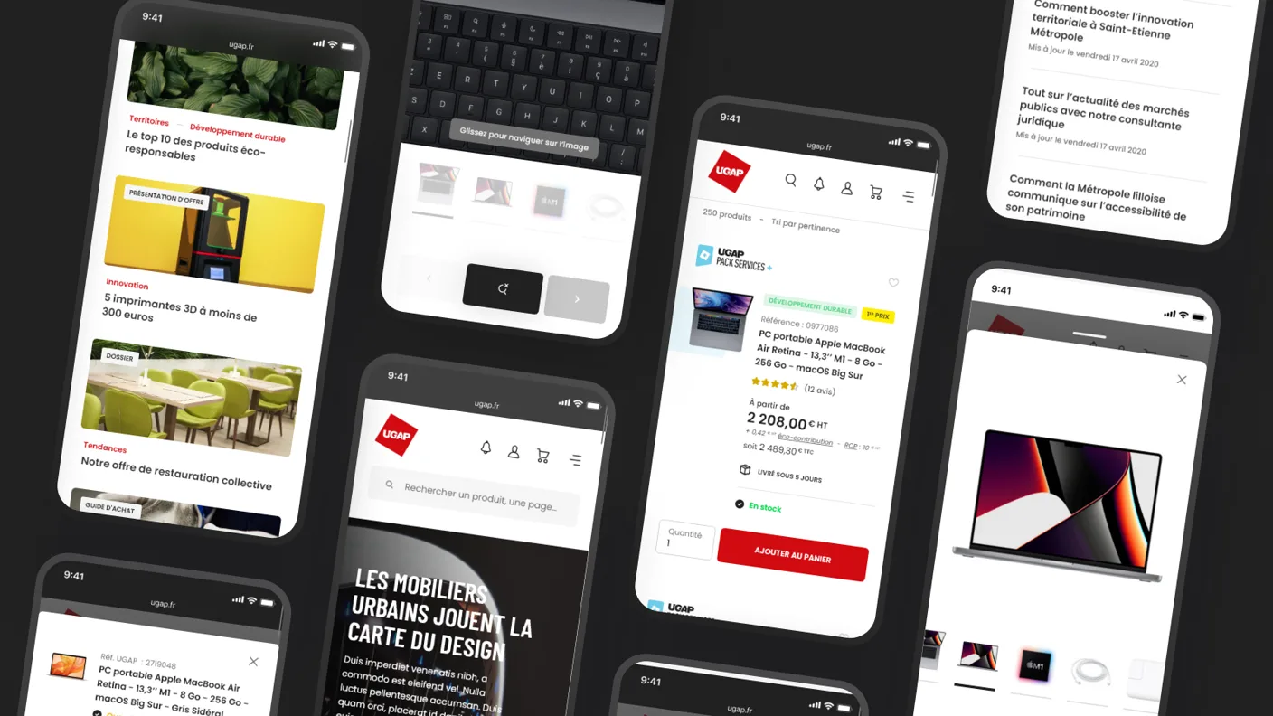
A set of UGAP mobile screens: the magazine feed, a product listing, a product detail with an add-to-cart panel, search and the homepage hero.
The same system on mobile: magazine, listing, product, search.

Editorial and buying guides

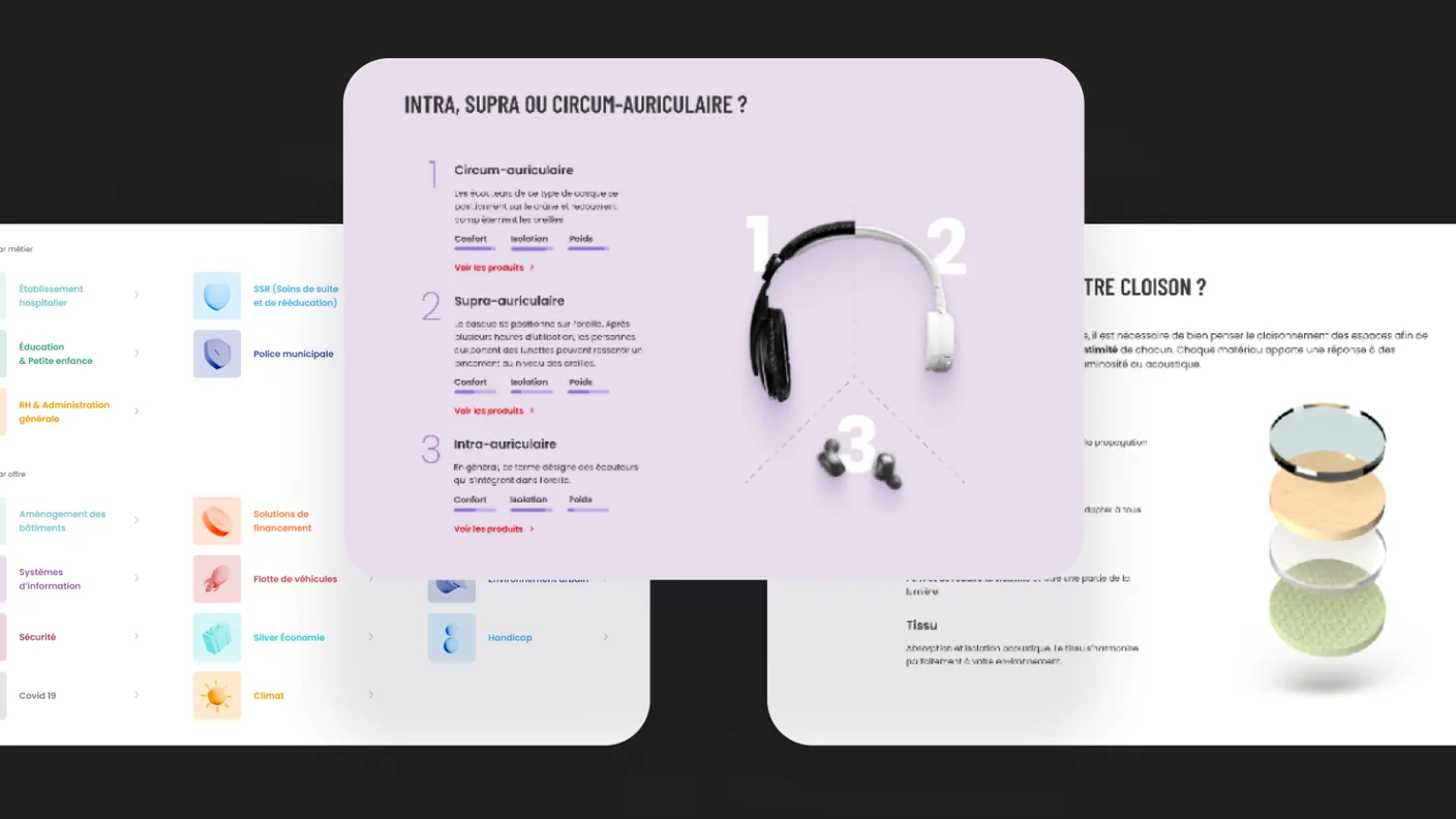
UGAP editorial screens: an interactive buying guide comparing intra, supra and circum-aural headphones with a 3D render and comfort, isolation and weight bars, a partition-material comparison, and a solutions menu organised by profession and by need.
Buying guides and the magazine: editorial that helps buyers choose.

System and craft

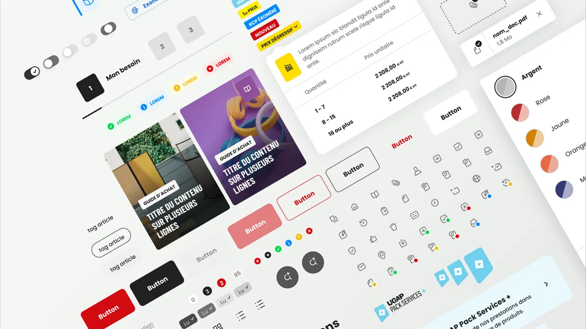
All of it runs on one design system and a custom icon set built for the reach of the catalogue, from firefighting gear to office chairs.

A UGAP design-system board: toggles, steppers, status badges, buttons in every state, a pricing table, buying-guide cards and colour swatches.
Design system
A grid of custom UGAP line icons covering vehicles, medical supplies, furniture, safety equipment and more, with a few picked out in colour.
Custom icon library

Accessibility by mandate

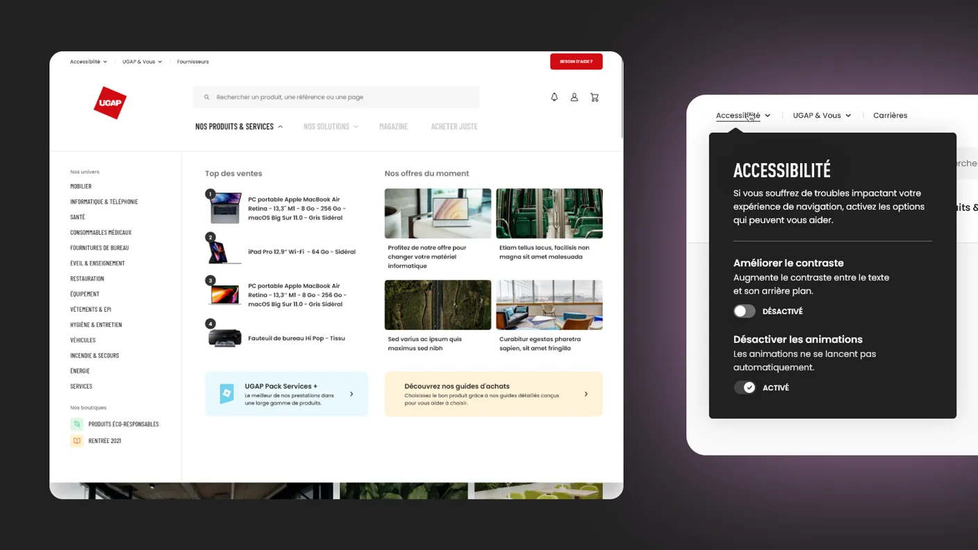
For a public audience, accessibility is a legal requirement, built in from the start. RGAA-compliant patterns and front-end throughout, with a panel to raise contrast or stop animations.

The UGAP 'Nos produits et services' mega-menu open over the catalogue, beside an accessibility panel offering higher contrast and an option to disable animations.
The mega-menu and the accessibility panel: raise contrast, stop animations.

CPB Paris 2023

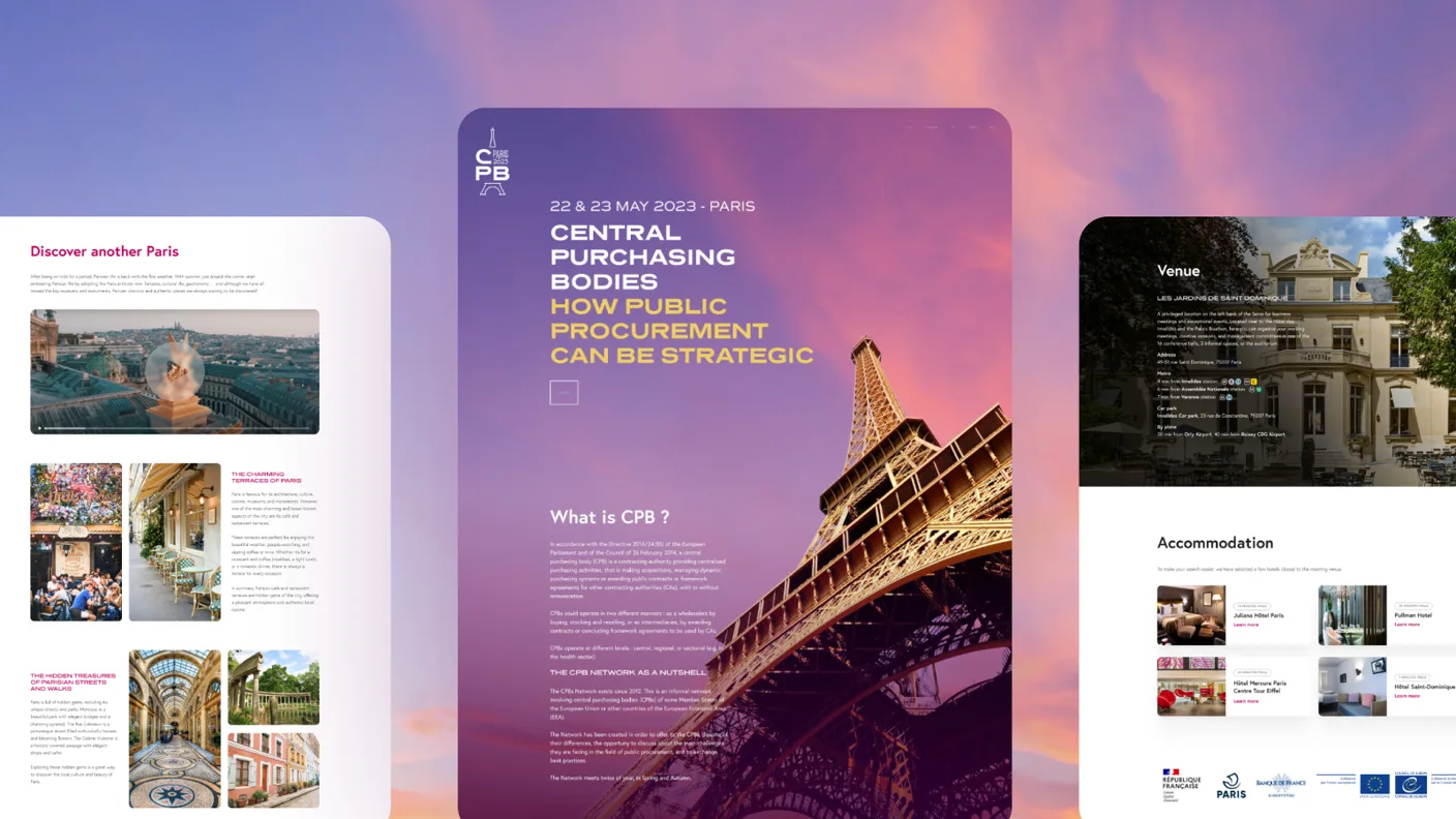
Beyond the catalogue: the event UGAP ran to bring central public purchasing bodies together in Paris, with a brand of its own. I did the full web design and front-end integration of the event site, in a register that has nothing to do with the catalogue.

The CPB Paris 2023 event website: a purple sunset hero behind the Eiffel Tower titled 'Central Purchasing Bodies, how public procurement can be strategic', with a 'what is CPB' section, venue and accommodation details, and EU institutional logos.
CPB Paris 2023: a different register, web design and integration end to end.

What used to run on email, phone and spreadsheets ships today as one guided flow, built to the RGAA standard. This is the site UGAP runs now.

DeFi Collective

The DeFi Collective works to keep on-chain finance transparent and tamper-proof, with no owners and no single point of control. It had a technically credible community, but no visual presence to match.

RoleDesign + front-end
ScopeBrand identityWebsite

I built the full identity from scratch, around the colony they named themselves after: the Ants. The hard part was coherence: making a niche, technical mission look established and trustworthy to an audience that runs from developers to policymakers. I carried it across the site (I built the front-end too) and their social channels.

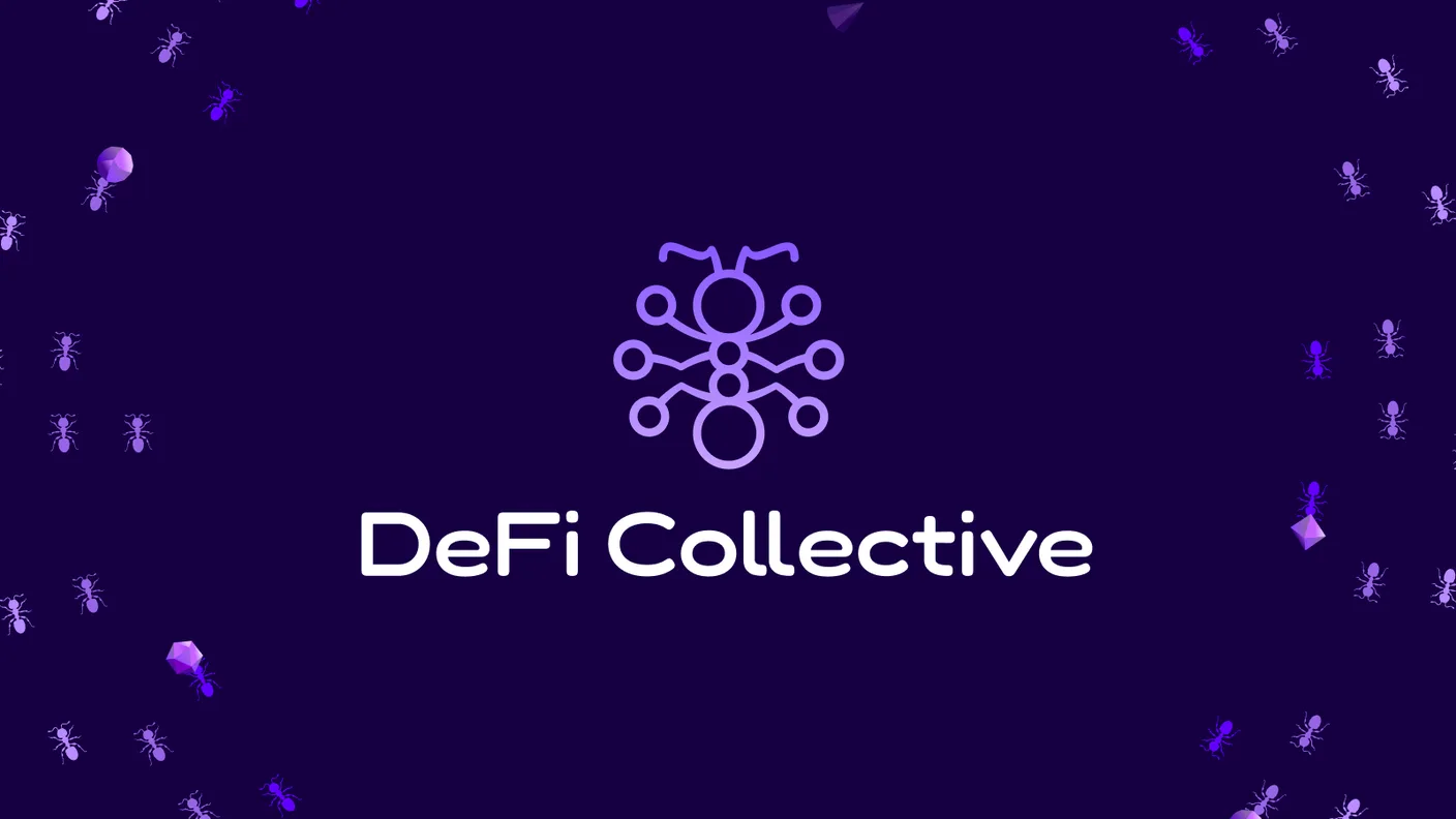
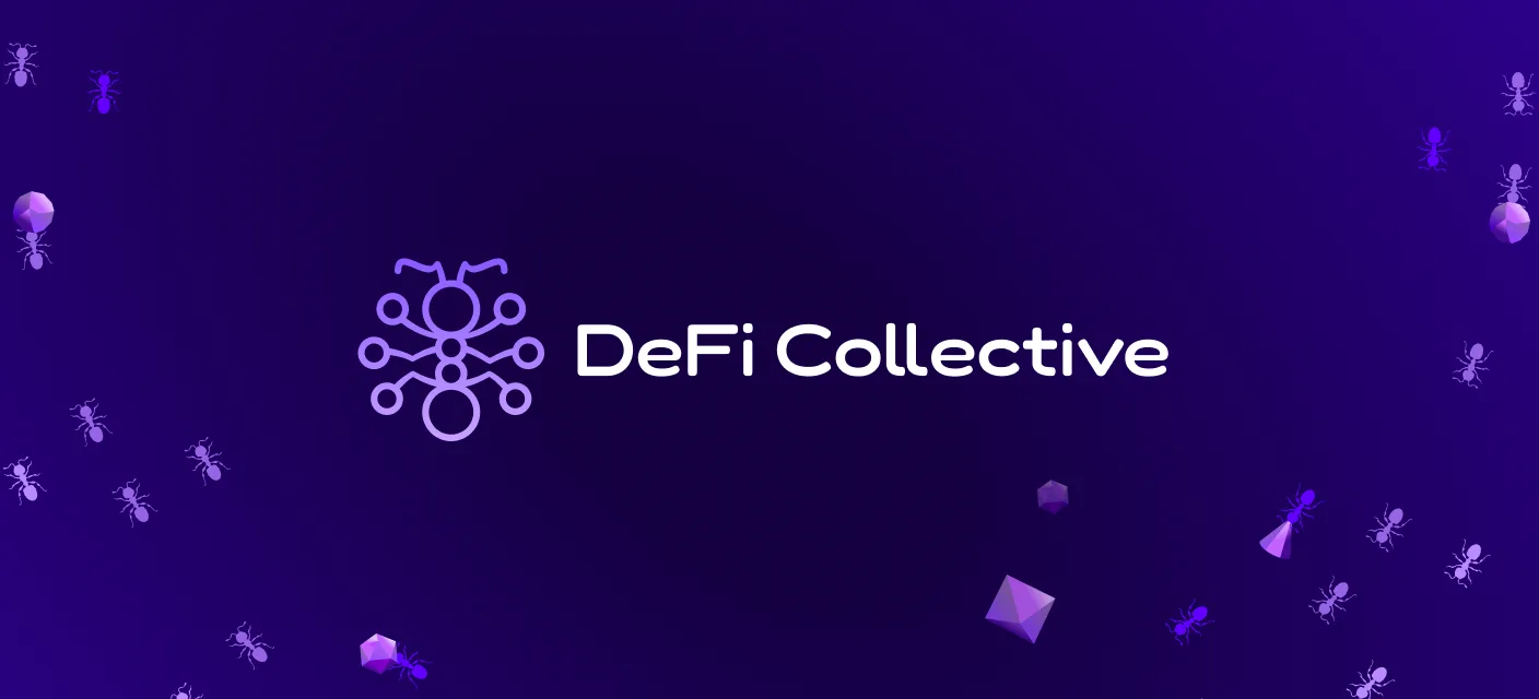
The DeFi Collective logo: the ant-network mark above the 'DeFi Collective' wordmark, on a deep-purple field scattered with ants and low-poly crystals.
The logo: a mark that reads two ways at once, an ant and a network of nodes.
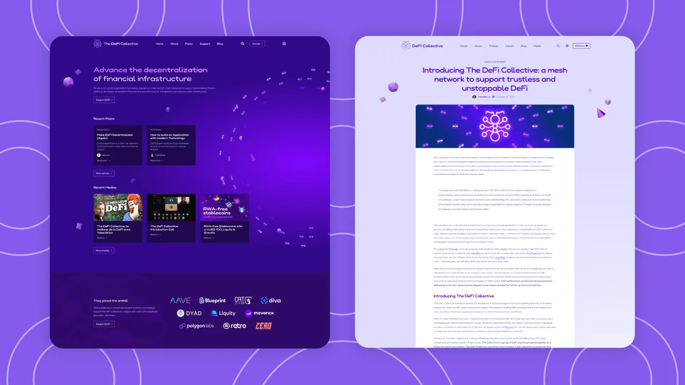
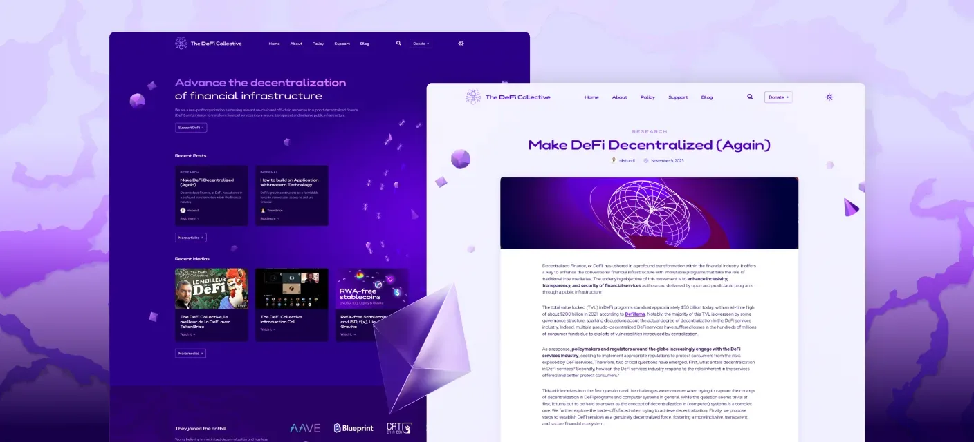
The DeFi Collective website in dark and light: a home page headed 'Advance the decentralization of financial infrastructure' with recent posts and media, and a research article, both on a deep-violet field scattered with ants and low-poly crystals.
The site in dark and light. I built the front-end too.
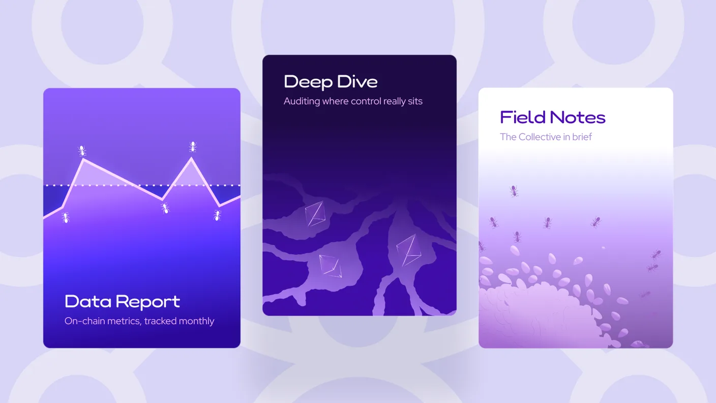
Three DeFi Collective editorial cards: 'Data Report, on-chain metrics tracked monthly' with an ant-dotted line chart, 'Deep Dive, auditing where control really sits' over dark roots and Ethereum crystals, and 'Field Notes, the Collective in brief' with ants carrying grains.
Content templates for the research they publish.
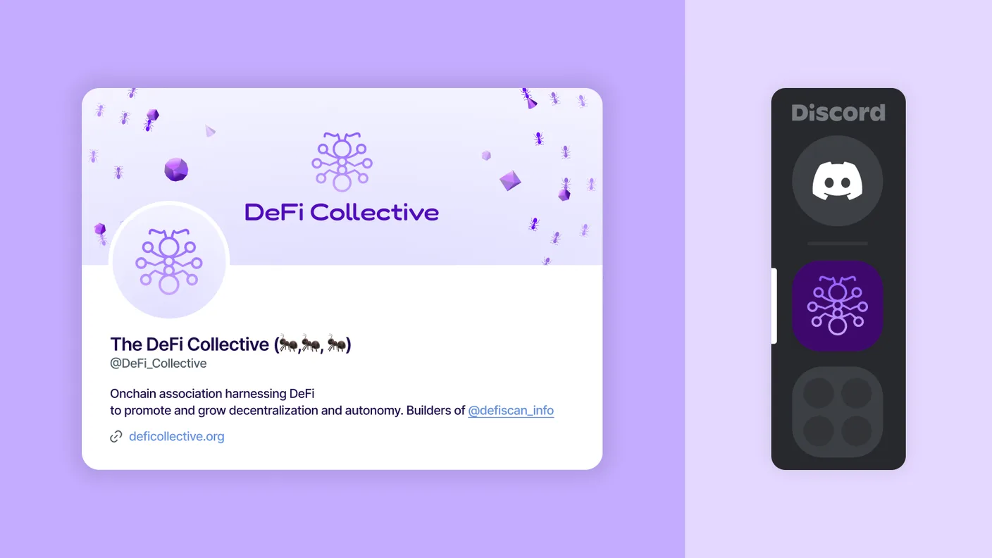
The DeFi Collective's social presence: an X profile with the ant-network avatar and a banner scattered with ants and crystals, the handle @DeFi_Collective and its bio, beside the same mark set as a Discord server icon.
The same system on X and Discord: profile, banner, avatar.
The DeFi Collective mark embroidered in violet thread on heather-purple fabric: linked rings and stems that read as both an ant and a network of connected nodes.
The same mark, stitched in thread.
A profile illustration for one of the DeFi Collective founders: an ant rendered as a glowing violet knight holding a crystalline sword, the ant-network mark on its chest, against a dark background.
A profile illustration I made for one of the founders.